Perth Painting: 11 Tips for Selecting The Right Paint Colour For Your Home
Watching paint dry might not be your idea of a fun afternoon, but perhaps choosing a paint colour could be. After all, the shade of paint you choose can dramatically affect not only how your home looks but also how you feel.
Choosing a paint colour isn’t a straightforward process. You need to know what you’re trying to achieve, how you’d like to feel, which colours are suitable for which rooms, and whether the new paint job will chime with your furniture.
In this article, we’re going to take an in-depth look at how to select the best paint colour for your home. By the end of it, you should feel a lot more confident and informed about which colour you should choose and why.
Experiment
Although you might be tempted to commit to a particular colour of paint from the start, that’s probably not a good idea. A much better (and less risky) approach is to experiment with different colours of paint first by applying them to small sections of wall and seeing whether you like them. Although you might find a particular colour as it appears on a colour chart appealing, the same colour can look different when applied to the walls of your home, thanks to lighting and context.
Start by applying a few patches of colour to a section of wall and then observe the paint at different times of the day. Do you like the way it looks in the morning and evening? Or would you prefer something brighter that stands out more? You’ll only find out if you experiment.
Think In Terms Of Colour Schemes, Not Individual Colours
Choosing paint for your walls is, unfortunately, more involved than just picking a colour that you like. You also have to consider the theme of your home. Themes pop up all over the place in the world of design – from website builders to publishing software. But themes are just as important in your home, if not more so.
You may like a particular shade of blue, but that shade might not work with your brown countertops or green carpets. Paint, therefore, has to complement the existing colours in your environment. It’s not something that can stand-alone.
How do you create a colour scheme? The easiest way is to use a colour wheel. A colour wheel is a particular arrangement of colours that allows you to select combinations that work well together. The wheel arranges colours into segments around the centre. All you then need to do is choose colours that are opposite each other, or that lie in equal intervals from each other clockwise and anti-clockwise.
Think About Your Mood
Paint colour can have a dramatic impact on how you feel. Neutral tones help to promote feelings of relaxation, whereas bold, dark colours evoke feelings of intensity. Brighter, lighter shades elicit feelings of freedom and freshness.
Of course, when it comes to colour selection, everyone reacts differently. Some people find neutrals to be calming while others consider them dull, boring, and in extreme cases, irritating.
Select Paints Based On Your Upholstery
If you’re painting a room with bedding, sofas, drapes or anything else that incorporates material, nothing is stopping you from using these to pull your inspiration. In fact, it’s probably a good idea that you do. Unless you’re swapping out all the fixtures and fittings in a room for new, then choosing a complementary paint colour is a must.
Choose The Right Finish
Paint comes in a variety of finishes. Each of these finishes has a specific application, depending on your needs. In general, you should go for a matt finish if you’re trying to hide imperfections. The more gloss a finish, the shinier will be the resulting paint job, but any defects will be more visible.
Check out these tips for choosing the right finish:
- Hi-Gloss Enamel. High-gloss enamel finishes are for high-use areas, like stair rails and furniture. They’re for all those surfaces that will regularly come into contact with hands or feet.
- Semi-Gloss Enamel. Semi-gloss enamel is the next step down from hi-gloss. It’s still shiny but doesn’t have the same mirror finish as the ultra-glossy stuff. Use it in areas that are exposed to moisture, like the kitchen and bathroom, or apply it liberally to kitchen cabinets and doors.
- Low-Sheen Acrylic. Low-Sheen Acrylic paint comes with a bit of shine and can be wiped down more easily then matt, making it a good option for areas that are likely to see splatter, like the kitchen or kids rooms.
- Matt Acrylic. Matt doesn’t have much shine, so it is highly suitable for all areas, except where high traffic is expected. It does a good job at hiding wall imperfections and is easier to touch up later down the road.
Remember, the finish you choose will dramatically alter the appearance of the paint. Shiny paint feels much more intense than matt.
If In Doubt, Go Neutral
While there’s a time and a place for bright, dazzling colours, they’re not always appropriate. Neutrals, however, are. What’s good about neutrals is that even though they lack the pop of some brighter paints, they are an enormous variety from which to choose. You can use greys with a hint of slate blue, or select neutrals that are more on the green end of the spectrum. Even small changes in colour can have a significant effect on how the final room feels, meaning that you don’t necessarily lose excitement by going neutral.
Use Historical Inspiration For Paint Colours
If you live in an older home – or even if you just want to make your current abode look more sophisticated – then take inspiration from historical paint colours. Rather than go with the safe options, some homes benefit enormously by choosing striking colours that complement the existing furniture.
Antique furniture, especially black and gold furniture, tends to sit well with desert yellows. Desert yellows might not be a popular choice for many contemporary homes, but if you’re not after a modern look and want to update an older-looking room, then these kinds of pastel colours can work wonders. Light greens, blues and reds all have their place in the right context.
Go A Shade Darker
Shade is a technical term that refers to the brightness of a colour. The same colour hue (as denoted by the light frequency it emits) can have a variety of shades, running from black to white. Going a shade darker can often help to lift a room while preserving its original characteristics and style. By simply changing the shade, you can avoid clashes while at the same time making a room appear more sophisticated.
If going darker doesn’t look good, then try the whole process in reverse. Test out lighter shades of your existing hue to see whether there is an improvement or not.
If Redecorating Your Entire Home, Use Accent Colours
If you’re redecorating your whole house, then it pays to be methodical and choose colours that enhance the overall impact of your home. With the right colour choice, you can improve the transition between rooms and make your house feel bigger.
The best strategy for creating seamless transitions from one space to another is to start with a base colour – usually a neutral of some description – and then paint other rooms in related shades. The goal should be to make all rooms in the house feel interrelated and yet distinct in their own right. When done correctly, using accent colours strategically can improve how spacious your home feels, adding volume and reducing the sense of clutter.
Personalise Your Paint Job
Although it can be helpful to browse ready-made paint colours for inspiration, it is sometimes better to get a paint manufacturer to create bespoke paint for you. Don’t worry about repainting in the future: as long as you ask the paint shop to create a record of how they made the paint, this will allow you to touch up your existing work at a later date if you so require.
Going with something custom ensures that you get the exact hue that you need for your particular setting. With personalised paint, you can choose a colour that sits between two colours on the colour wheel, giving you infinitely more options.
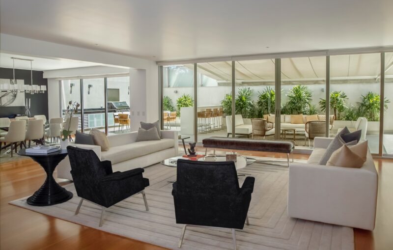
Incorporate The Outdoors
Finally, it’s worth looking outside for paint inspiration, especially if you’re renovating an outdoor-indoor space. Paint which complements your garden and landscaping will help to make the transition from home to garden feel more natural, helping both merge. Look at the primary colours of your garden and try to mimic them in your indoor-outdoor space.
Conclusion
So, there you have it: how to select the best paint for your home. Choosing a paint colour can be a tricky business, but by following the principles laid out in this article, you’re much less likely to get into trouble. Or contact Gary and his award winning team, you may even be eligible for a free colour consultant to assist you in choosing the right colour for your home.